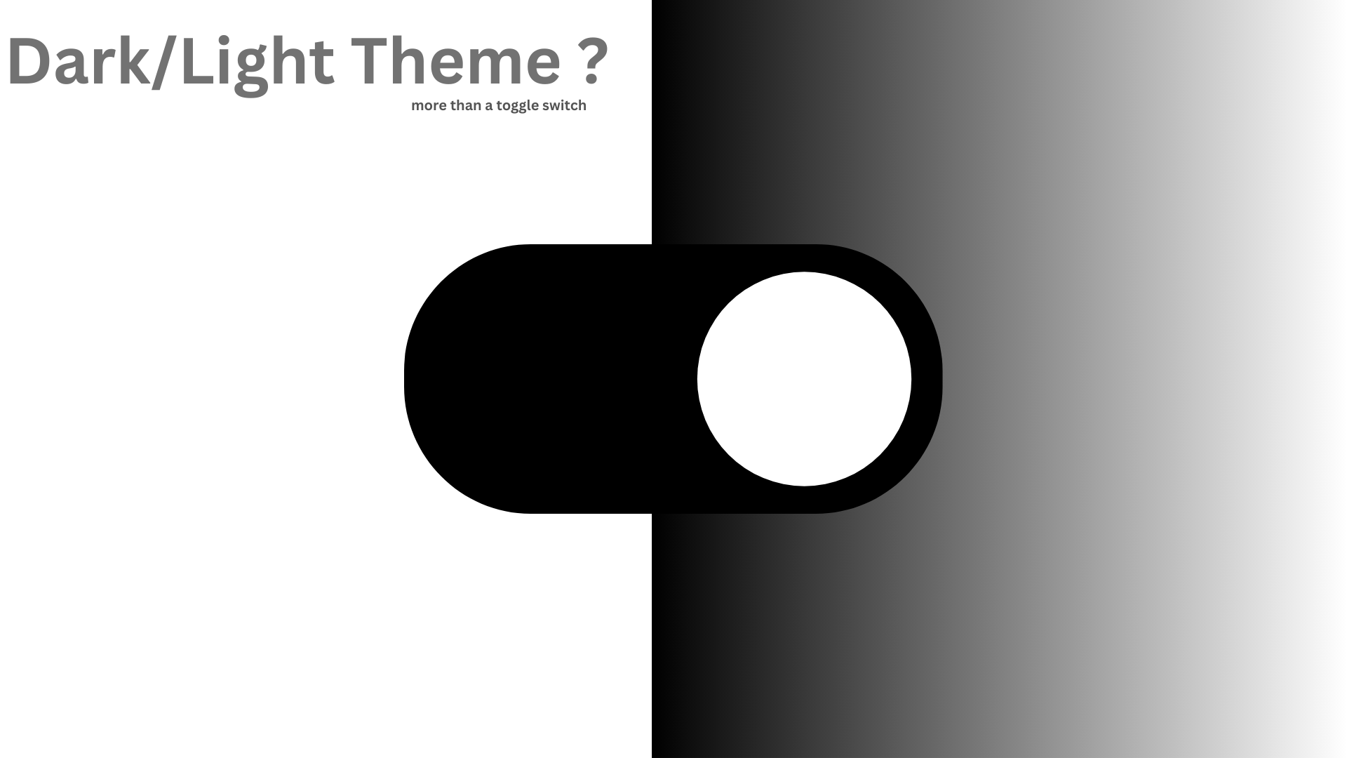
You don’t want “just a toggle.” You want a theme system that:
- remembers the user’s choice,
- avoids the flash of the wrong theme,
- scales to more themes (and brands) later,
- and stays accessible.
Here’s a battle-tested approach that balances UX, performance, and future growth.
1) Start with Design Tokens (not colors)
Hard-coding hex values in components won’t scale. Define semantic tokens (e.g., --color-bg, --color-text, --shadow-elev-1) and map them to physical values per theme.
/* Base tokens (defaults) */
:root {
  --color-bg: #ffffff;
  --color-text: #111111;
  --surface: #f6f6f6;
  --link: #0b5fff;
}

/* Dark tokens */
:root[data-theme="dark"] {
  --color-bg: #0c0c0c;
  --color-text: #f5f5f5;
  --surface: #171717;
  --link: #6ea8ff;
}

/* Use tokens everywhere */
body { background: var(--color-bg); color: var(--color-text); }
a { color: var(--link); }
Why this matters: Semantic tokens make it trivial to add more themes (e.g., “dim,” “high-contrast,” “brand-x”) and to theme entire component libraries without touching component logic.
2) Respect the user’s system preference first
Most users prefer sites to follow their OS setting initially.
@media (prefers-color-scheme: dark) {
  :root { color-scheme: dark; }
}
@media (prefers-color-scheme: light) {
  :root { color-scheme: light; }
}
color-scheme also helps the browser render form controls and scrollbars that match the theme.
3) Persistence strategy: choose the right store
You need the theme before the app paints to avoid the “flash.”
Options:
- localStorage (client-only): simple, but suffers a brief flash on first paint.
- Cookie (SSR-friendly): read theme on the server, render the right CSS from the first byte (best for Next.js/Nuxt).
- Database (per user): for signed-in users, store preference server-side and mirror to a cookie for SSR.
Recommended hybrid:
- On toggle, write cookie (for SSR) and localStorage (for quick client reads).
- For authenticated users, sync to the profile table too.
4) Prevent the flash of incorrect theme (FOIT/FOUC)
Inline a tiny script high in <head> that sets the data-theme attribute before CSS loads.
<script>
  (function () {
    try {
      const cookie = document.cookie.match(/(?:^| )theme=([^;]+)/);
      const stored = window.localStorage.getItem('theme');
      const systemDark = window.matchMedia('(prefers-color-scheme: dark)').matches ? 'dark' : 'light';
      const theme = (cookie && cookie[1]) || stored || systemDark;
      document.documentElement.setAttribute('data-theme', theme);
      document.documentElement.style.colorScheme = theme;
    } catch (e) {}
  })();
</script>
Place this before your CSS bundle so the initial paint is correct.
5) The toggle: simple, accessible, and reactive
- A button with
aria-pressedand a clear label. - Update
data-theme, write cookie + localStorage, and optionally emit an event so components can react.
function setTheme(next) {
  document.documentElement.setAttribute('data-theme', next);
  document.documentElement.style.colorScheme = next;
  localStorage.setItem('theme', next);
  document.cookie = `theme=${next}; Path=/; Max-Age=31536000; SameSite=Lax`;
}
Consider a “System” option that tracks OS changes dynamically:
const mql = window.matchMedia('(prefers-color-scheme: dark)');;
mql.addEventListener('change', e => {
const pref = localStorage.getItem('theme');
if (pref === 'system' || !pref) {
setTheme(e.matches ? 'dark' : 'light');
}
})
6) SSR with Next.js (no flash, correct HTML)
On the server, read the cookie and set data-theme in the initial HTML. In the App Router, this typically lives in layout.tsx (reading headers via cookies()), or via middleware to inject a default.
Minimal flow:
- Read
themecookie in server component. - Add
data-theme={theme}to<html>. - Inline the head script above to reconcile on hydration.
7) Tailwind or component libraries
- Tailwind: use the
classstrategy or adata-themeselector.- In
tailwind.config.js, setdarkMode: ['class', '[data-theme="dark"]']. - Use utilities that refer to CSS variables:
bg-[var(--color-bg)].
- In
- Third-party components: theme them by overriding their CSS variables or exposing a design-token layer for them.
8) Accessibility first
- Aim for WCAG AA contrast (at least 4.5:1 for text). Test both themes.
- Ensure focus states are visible in both dark and light.
- Avoid pure black (#000) on pure white; slightly soften both to reduce eye strain.
- Offer a high-contrast theme token set if your audience requires it.
9) Performance & correctness
- Do not re-compute themes in heavy JS during runtime; rely on CSS variables.
- Keep the head script tiny and synchronous (no imports).
- Scope animations that depend on theme to respect
prefers-reduced-motion. - Test across color profiles and HDR/OLED screens (deep blacks sometimes crush detail).
10) Security & privacy notes
- Theme is non-sensitive, but still set cookies with
SameSite=Laxand a saneMax-Age. - If you mirror to a server profile, debounce updates to avoid extra writes.
11) Scaling beyond two themes
Because you used tokens, adding themes is easy:
:root[data-theme="dim"] { /* tweak only a few tokens */ }
:root[data-theme="hc"]  { /* high-contrast overrides */ }
:root[data-brand="acme"] { /* brand accents without redoing dark/light */ }
Layer themes (data-theme) and brands (data-brand) independently. This avoids a combinatorial explosion (dark-brandA, light-brandA, etc.).
12) Testing checklist
- First paint shows correct theme (no flash).
- Toggle persists across page reloads and routes.
- System mode follows OS changes.
- Cookies respected in SSR (open a new tab/window).
- Contrast and focus states pass in both themes.
TL;DR Implementation Plan
- Define tokens with CSS variables; avoid raw colors in components.
- Respect system preference by default.
- Persist with cookie + localStorage (and DB for signed-in users).
- Inline a pre-CSS head script to set
data-themeon first paint. - SSR reads cookie and sets HTML attributes to prevent flashes.
- Test accessibility and scale by adding more token sets later.
Build it once, scale it forever. Your users get the right theme instantly, and your team gets a system that grows with the product not against it.